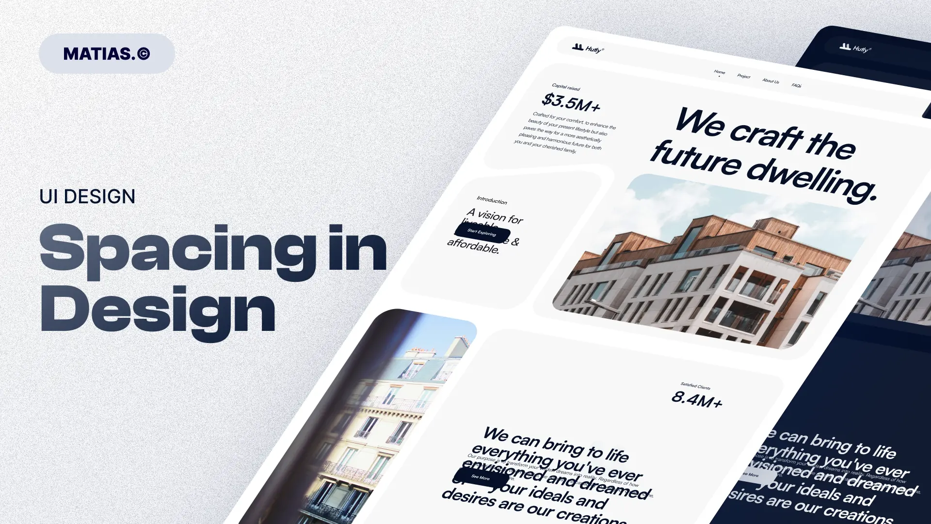
Spacing in Design If you’ve ever looked at a layout that felt cluttered, uncomfortable, or hard to navigate, the issue probably wasn’t the color palette or the typography. Most likely, the problem was spacing — that invisible yet powerful tool that can make or break your design.
Spacing, also known as white space, is one of the most underrated principles in design, especially for beginners. But here’s a hard truth: without proper spacing, even the most beautiful designs can feel amateurish, confusing, and unprofessional.
In this article, I want to show you that spacing isn’t just about “empty space.” It’s a strategic tool that creates hierarchy, clarity, elegance, and visual comfort.
Why Is Spacing So Important?
Imagine walking into a messy room. Clothes on the chair, books scattered on the floor, dishes piled on the table. Just picturing it feels overwhelming, right? Now imagine the same room, clean, organized, with everything in its place and plenty of open space to move around. Instantly more relaxing.
That’s exactly how spacing works in design. When elements have room to breathe, the user’s brain can process information more easily. Your website, app, presentation, or any visual piece becomes more readable, organized, and visually pleasing.
Without space, everything feels like it’s shouting at you. With space, each element gets its own moment to shine.
Spacing Isn’t Empty Space — It’s Visual Organization
A common mistake is thinking that white space is wasted space. In reality, it’s the complete opposite. Empty space has a very clear purpose: it guides the viewer’s eye and organizes the information.
Design is not just about what you add; it’s also about what you choose not to add. Sometimes, what you remove — or what you allow to breathe — has as much impact as what you include.
Types of Spacing in Design
There are different types of spacing that play key roles in design. The main ones are:
1. Padding (Inner Spacing)
This is the space inside an element, like the margin within a button, a card, or a text box. A button without padding feels cramped and hard to click. A button with enough padding looks more inviting, accessible, and balanced.
2. Margin (Outer Spacing)
This is the space outside an element, creating distance between it and neighboring elements. Margin helps separate sections, images, or text blocks, making layouts cleaner and easier to scan.
3. Line Height (Vertical Spacing in Text)
This affects how text reads. Lines that are too close together make reading exhausting. Too far apart and the text feels disjointed. The right balance provides comfort and flow.
4. Letter Spacing (Tracking)
This refers to the space between individual letters. It’s especially useful for titles, logos, or stylistic elements. Slight adjustments can change the tone from cramped to modern or elegant.
5. Gutter (Spacing Between Columns or Items)
This is the space between columns in a grid or between items in a layout. It’s essential for preventing visual clutter and keeping content organized.
What Happens When You Get Spacing Wrong?
-
Your layout looks unprofessional.
-
Visual hierarchy gets lost.
-
Reading becomes tiring.
-
Users feel uncomfortable, even if they can’t pinpoint why.
-
Your design communicates a lack of attention to detail.
How to Get Spacing Right
Here are practical tips I use every day as a designer:
-
Use consistent scales. Follow a spacing system based on multiples like 4, 8, 16, 24, 32, etc. This creates rhythm and harmony.
-
When in doubt, give it more space. It’s rare to ruin a layout by adding too much space — but very easy to mess it up by using too little.
-
Apply hierarchy through spacing. The more important an element is, the more space you can give it to stand out.
-
Test and adjust. There’s no perfect formula. Move things around, trust your eye, and refine until it feels right.
-
Adapt to context. Mobile screens require different spacing than desktops. Smaller screens need tighter but still comfortable spacing.
Spacing Communicates Emotion
It might sound poetic, but it’s true. Spacing affects how a design feels.
-
More space = sophistication, calm, elegance.
-
Less space = energy, urgency, sometimes chaos (intentional or not).
Look at premium brands like Apple. They embrace generous white space to project minimalism and focus. On the flip side, discount brands or fast-paced ads use tighter spacing to convey urgency and packed information — also on purpose.
Conclusion: Spacing Is an Act of Care
Next time you open Figma, Photoshop, or any design tool, before obsessing over colors or fonts, pause and ask yourself: “Are my elements breathing?”
Spacing isn’t just a detail. It’s one of the most powerful tools in design. Mastering it will transform your work from simply pretty to truly professional, functional, and pleasant to experience.